Bringing images to Readup
About a year ago, I showed Readup to a friend who was used to other reading apps. The first remark he made when seeing the home screen was: “Where are the images? This doesn’t look appealing to me.”
Since Readup’s founding, the absence of images has been a feature rather than a bug. The featured image of an article might tell more than a thousand words, but at Readup, we believe that reading those thousand words still matters more. The words allow for our assumptions based on an image to be reshaped by articulated text. If nobody reads an article, it might just as well have been an image with a caption.
Big tech’s failure to accept that “an article” and “a captioned image” are different things has, among other negative effects, made unintentional misinformation spread easier. People can share and boost articles by liking the headline, without actually reading the article.
Does that mean that we’re against featured images? Well no, they can be valuable! The title, description and featured image of an article serve as its sales pitch. A relevant image captures the theme or mood of an article and makes it easier for the reader to decide whether to read it or not. There isn’t much to dislike about that!
The problem is that article listings on the web are not created equal: not all articles have featured images. The images themselves are not created equal either: sensational images are more likely to grab our attention, whether they are representative of an article or not. By not showing images for articles, we were putting them on a more level playing field. Articles could still have bad or clickbaity titles, but bad images were at least not able to influence our reading decisions. We’ve heard that many readers appreciated this minimal quality of our app interface.
Today though, I’m revisiting this rule. Several long-time and new readers have asked for images in the app, and caring about the needs of readers is our core value. But at the same time, I want to retain the calm place of quality reading that Readup aims to be.
I approached this design challenge like I promise to tackle all design challenges: with the reader’s best interests in mind first. Because we don’t run ads, we measure our success by our reader’s happiness with the design changes we make, not by the number of extra page views they might generate. I won’t add or remove functionality or change layouts without a clear indication that this might add value for readers first, writers second, and publishers third.
Last month I rolled out an app-wide experiment to show a featured image on the Article of the Day - the first image in the Readup app. The AOTD is an article that has proven its quality. It deserves to be highlighted, because it has been vetted by the deep reading attention and ratings of our readers. With other words: it deserves an image to draw in readers.
That image has been received well, so now I’m expanding it to yesterday’s Article of the Day among other changes that make it easier to dive into a next read mindfully.
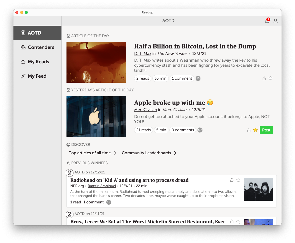
The two most recent AOTDs got big, left-aligned images on desktop apps, and top images on mobile apps. Consider them the daily cover mosaic of the Readup! The preceding AOTD winners got smaller, right-aligned thumbnails. I believe they are fun but generally less meaningful for a decision on whether or not to pick an article from a list. The titles, descriptions and Readup metadata come first in this process. Right-aligning list item thumbnails sounded like a good idea to support this. Previous Winners’ images are not shown on mobile yet, because I felt they are too overpowering compared to the titles. We might experiment with other, possibly configurable, mobile layouts later.
To all readers: savour these changes for a while. Recognize your first impressions, but see also how it affects your attitude towards the AOTD in a few days or weeks for now. Then let me know what you think! Here in the comments, or by mailing us at support@readup.com. We’re building this app for you!